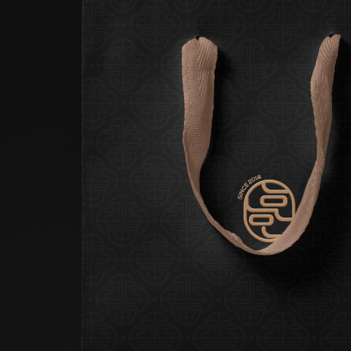
호호팩토리는 엄마의 마음을 지닌 봉제사들이 모여 만든 침구류 브랜드이자 사회적기업입니다. 볼드비팀에서는 기존의 엄마형상의 브랜딩에서 더 나아가 한국의 미를 더한 브랜드로 표현하고자 하였습니다. 기존의 협동조합 로고에서 단독 호호팩토리를 분리시키고 한국을 대표하는 침구류브랜드로 리브랜딩하였습니다.
Hoho Factory is a social enterprise created by seamstresses with mothers’ hearts. The Bold B team wanted to go beyond the existing mother-shaped branding and express the rebranding in a more traditional way with Korean beauty.
Client : 호호팩토리 협동조합
Branding Planner & Design : BOLD.B Branding
