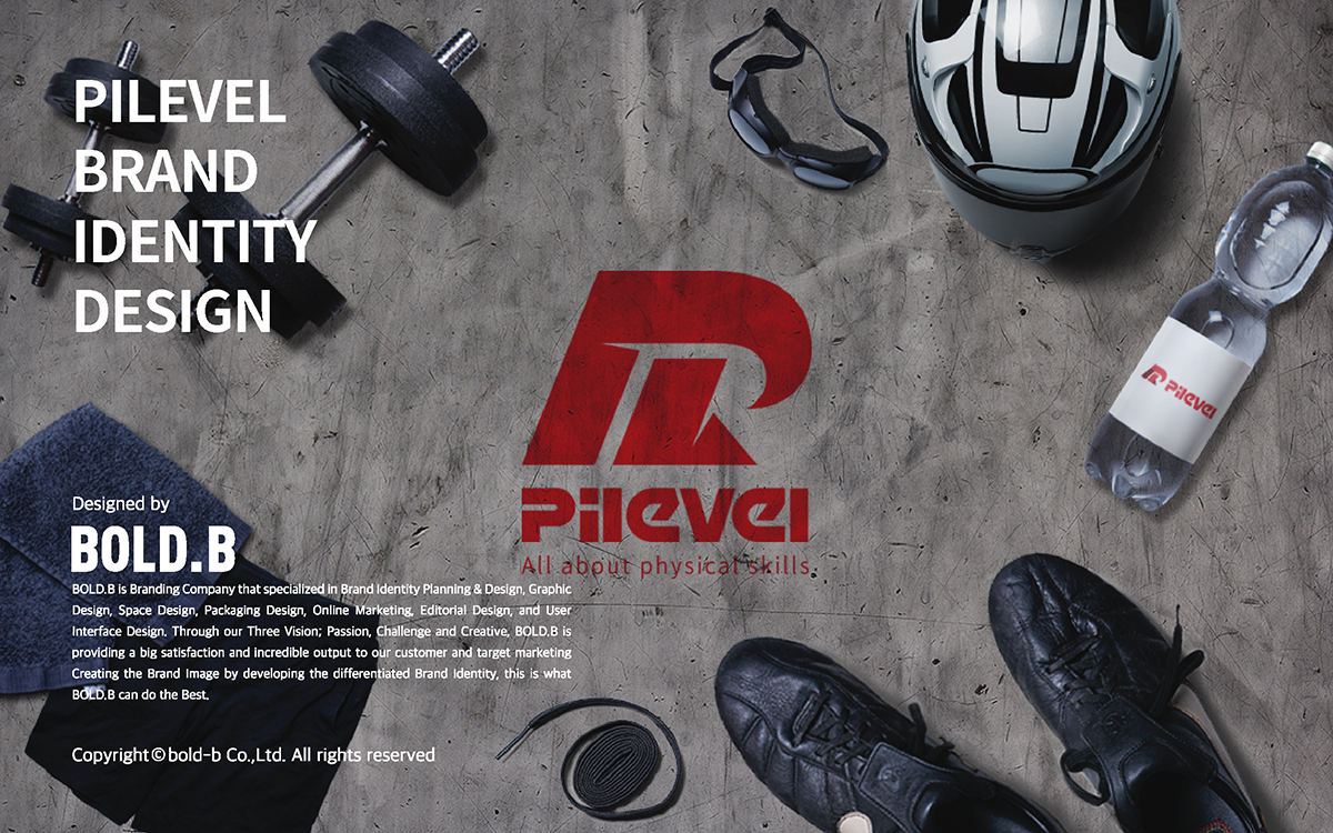
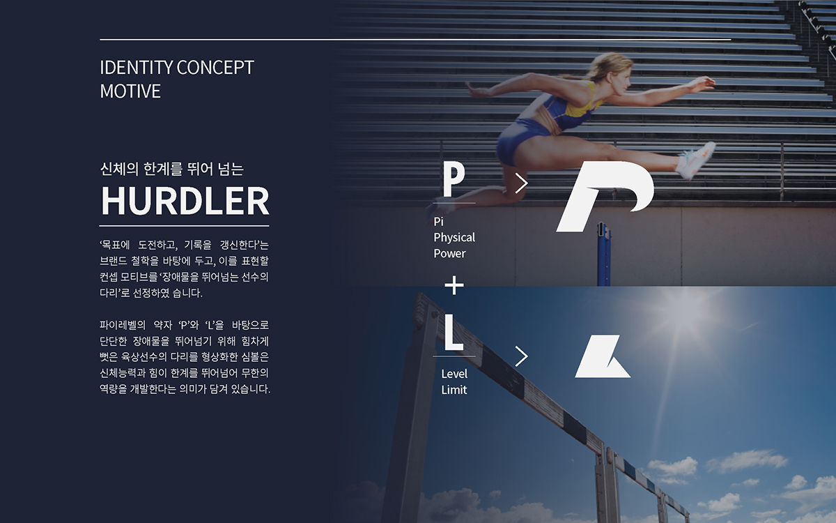
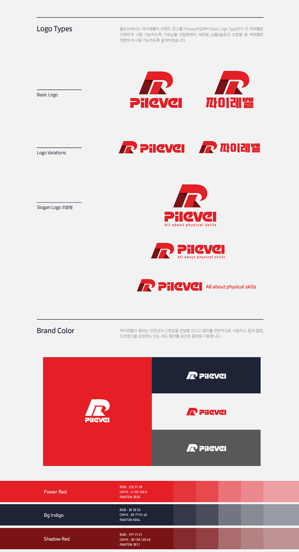
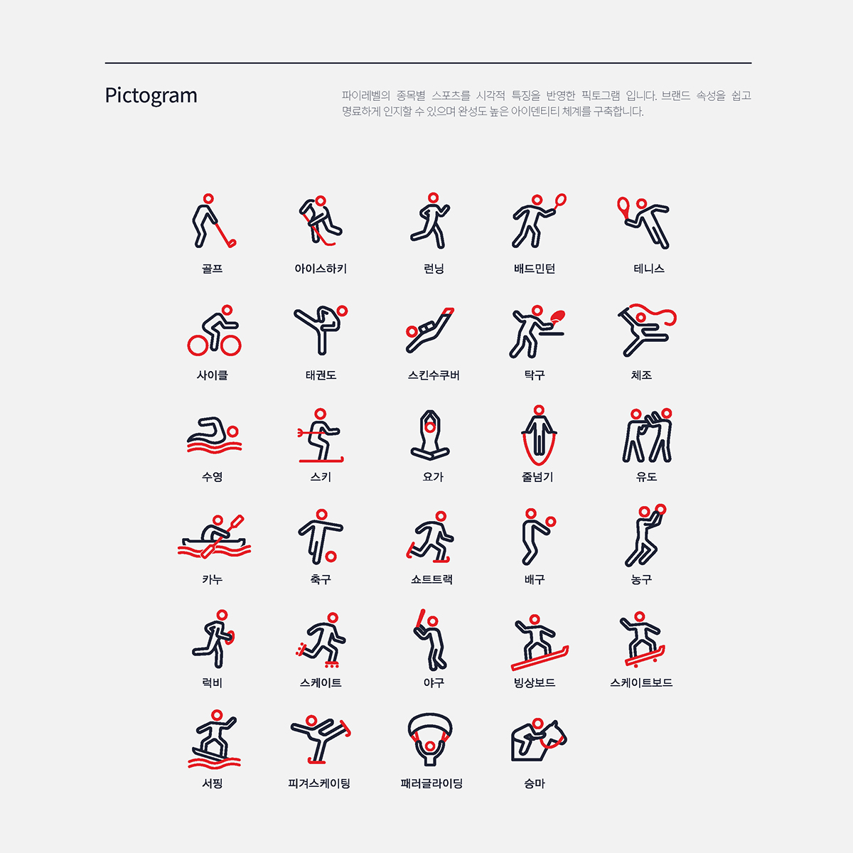
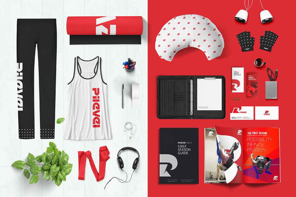
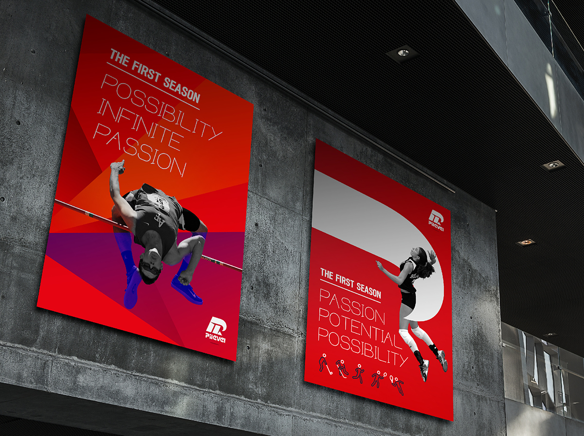
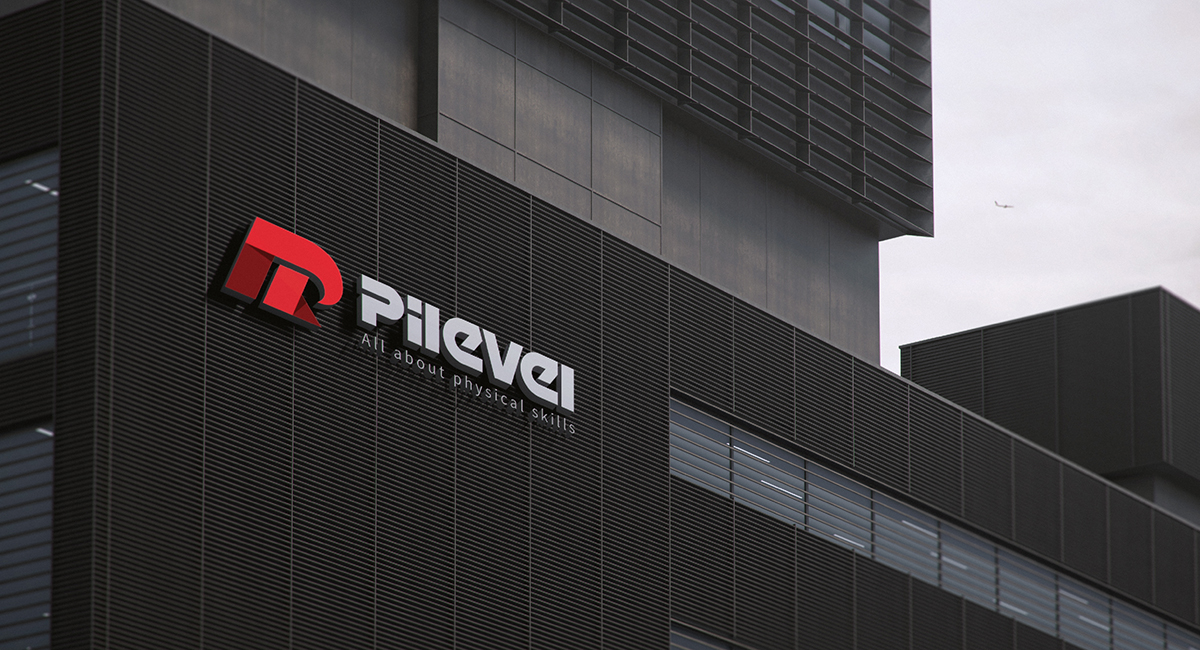
we proceed brand identity work of PILEVEL specializing in Sports Complex Business . We expressed the philosophy of the PILEVEL brand to challenge the goal and update the record. Symbolic representation of the legs of athletes who have been vigorously stretched to jump over obstacles has meant that physical abilities and powers go beyond limitations to develop infinite competence.