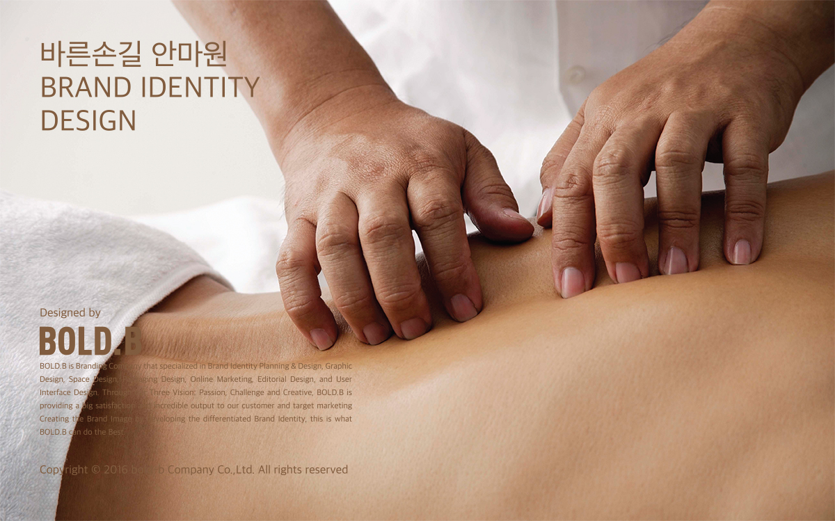
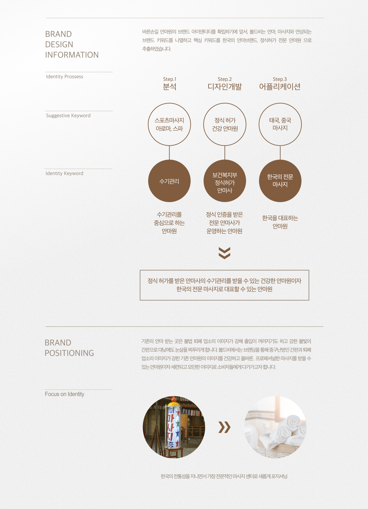
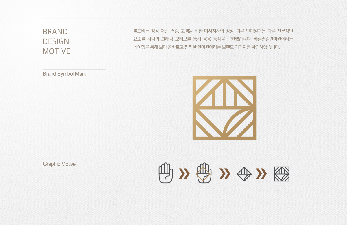
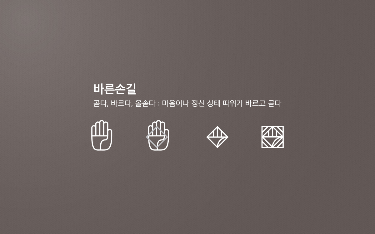
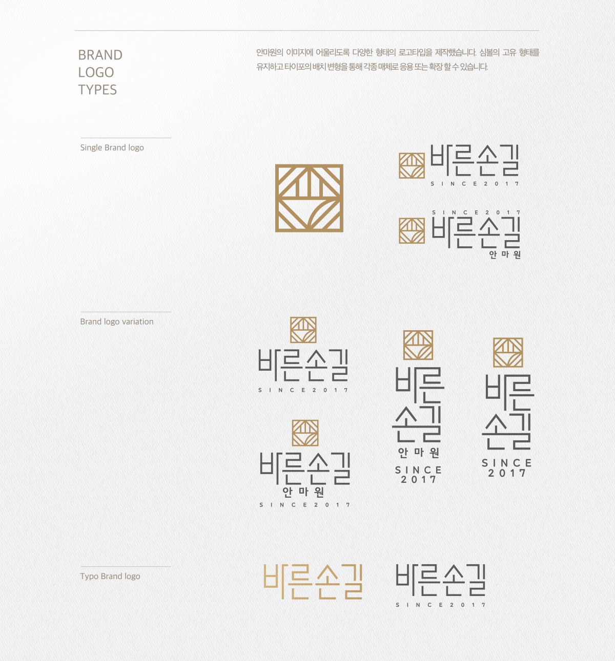
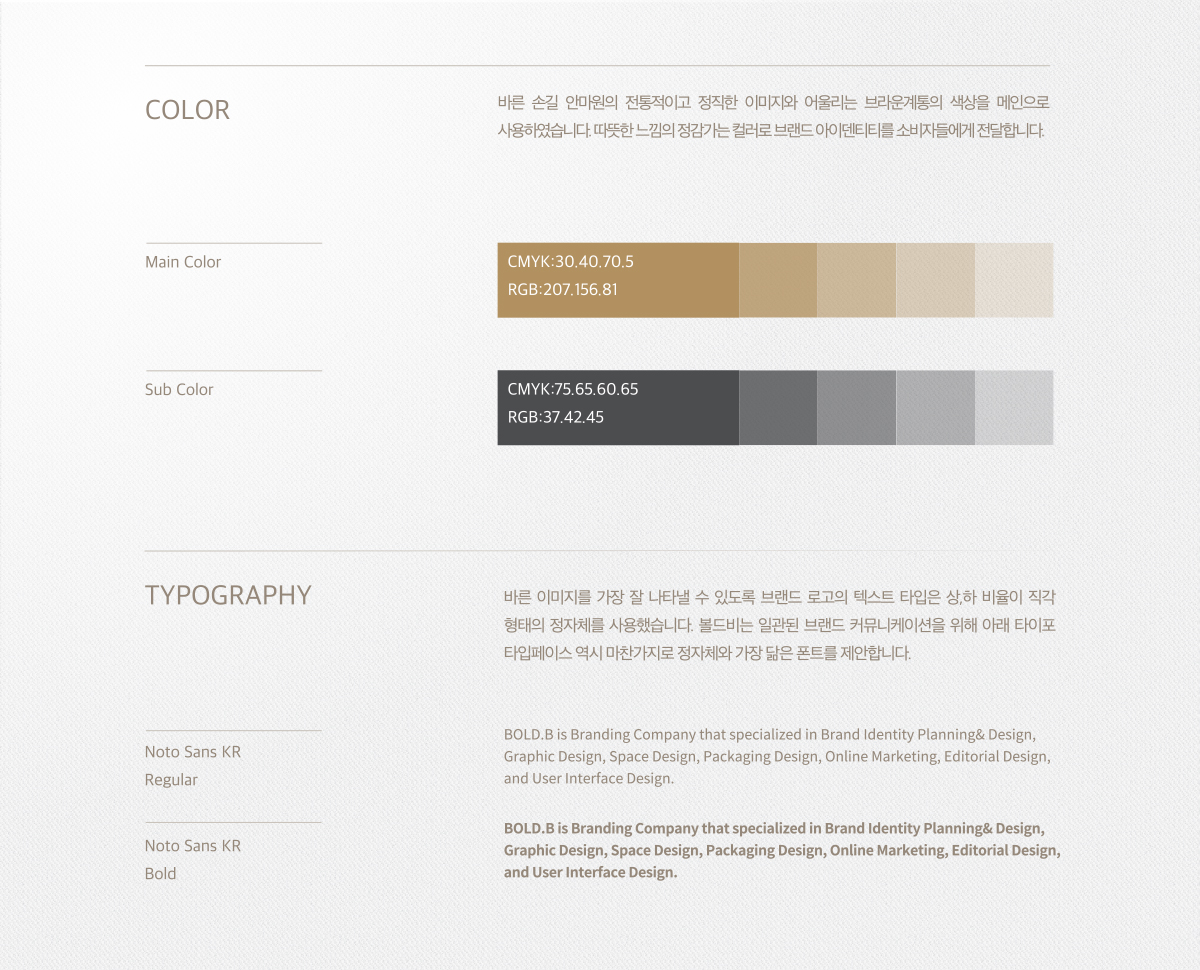
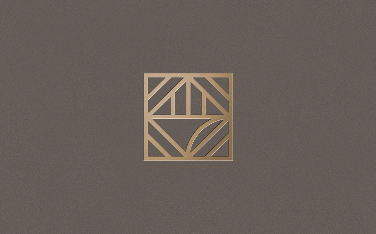
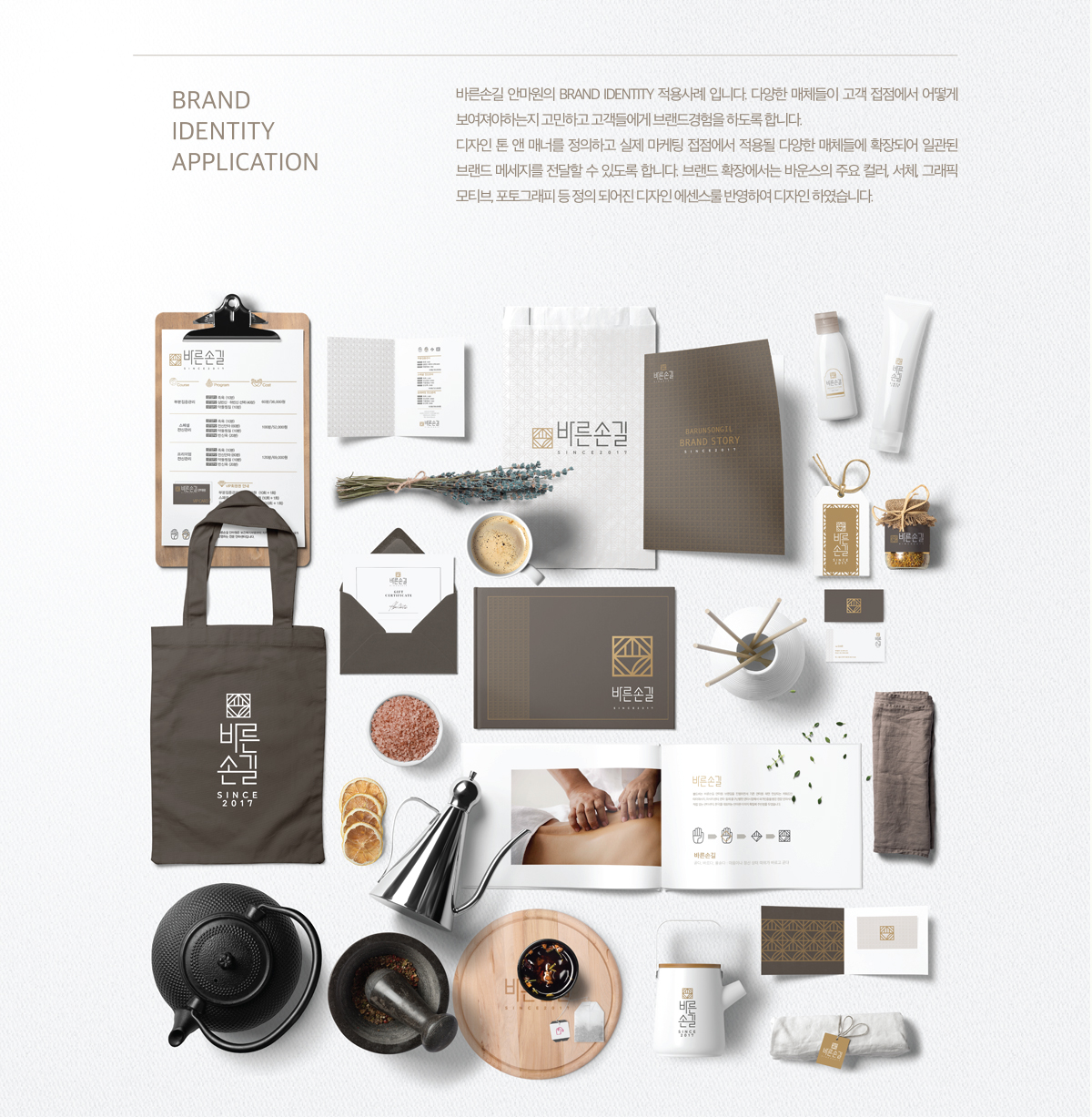
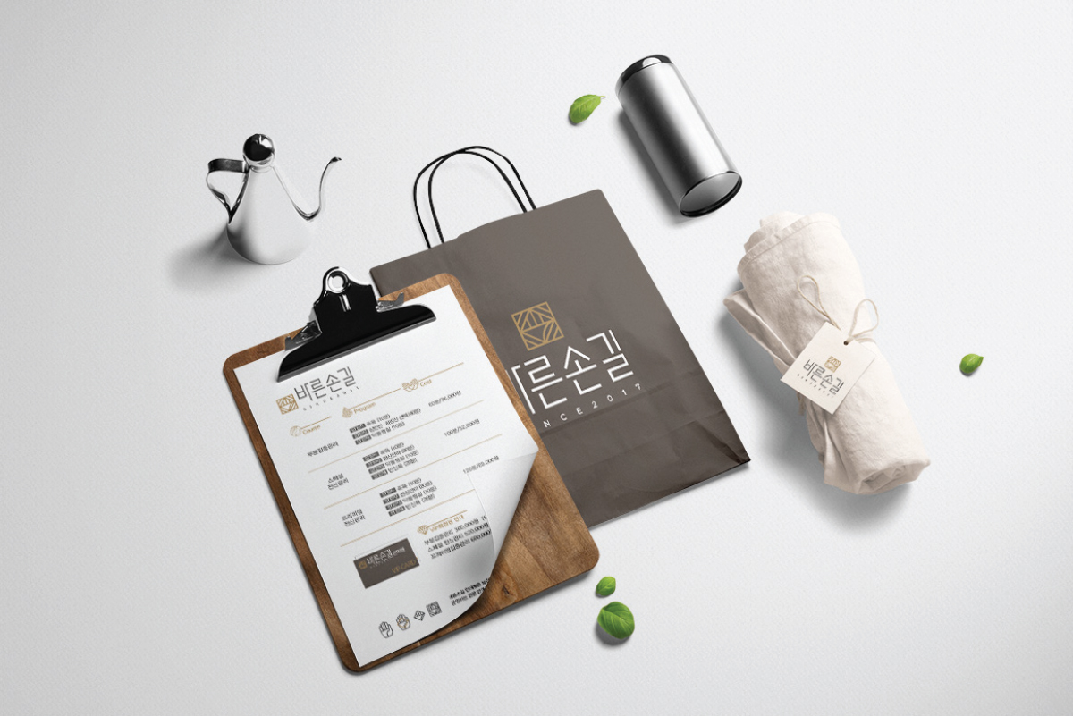
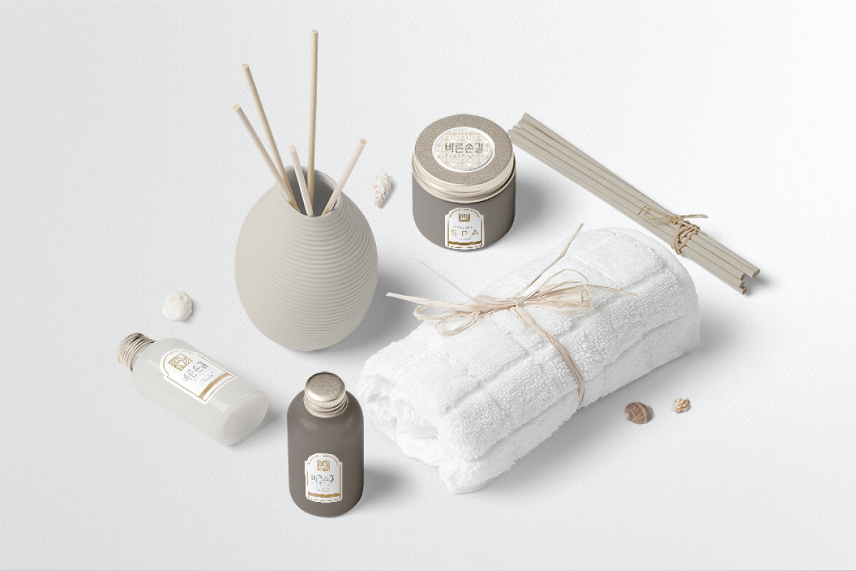
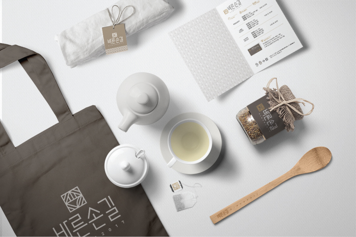
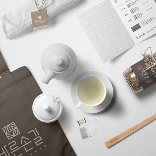
Bold-B brands a professional massage that is certified from Ministry of Health and Welfare. Main point of this project is changing negative image of existing massage service. Bold-B create new image of massage brand through naming ‘right touch’. Design ton and manner is Korean traditional color that represent Korean massage. Also, Bold-B directs sophisticated atmosphere.